Multi-lingual website
Challenge
Build a responsive, multi-lingual website for a window manufacturer to bring in more customers, educate users on company’s products + services, showcase past work, and make it easy for users to contact the business.
Solution
Constructed Lisman’s website to be attractive, informative and easy to navigate. Made versions of the website in both English and Hebrew. Designed graphics and text to be true to the company’s brand and story. Carefully structured the layout so that customer’s could effortlessly navigate between various pages and quickly request a quote.
DESIGN THINKING
Requirements
Multi-lingual
Two versions was made of each page, one in English and one in Hebrew. There is an easily identifiable button at the top corner of the page for the user to switch between languages. The pages have also been adjusted so the Hebrew words and images are read from R-L; while the English words and images are read from L-R.
High-quality images with a quick loading time
Images were optimized to reduce the file size without compromising on quality. Pages are tested for a high-speed score, even mobile devices.
Responsive website
Website is accessible through all device sizes from mobile phone to desktop.
Contact form / Request a quote
A contact form is located at the footer of each page for ease of access. A CAPTCHA security test is implemented added to protect the website against fraud.
Contact button
A sticky contact button is located at at the bottom corner of every screen. The button is animated to attract attention and includes several methods of contact such as calling, WhatsApp messaging, and emailing.
Brand Identity
To keep consistency with the company’s brand of sleek steel windows, a similar minimal and modern design is applied throughout the website. The main color scheme is black and white. The high contrast and framing resembles the company’s steel windows. A light gray background is used where needed to divide and break up content.
Challenges and What I Learned
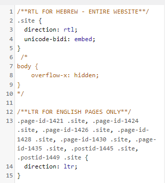
Creating a multi-lingual website where the text-directions were different was a challenge that required additional CSS. The “direction” property for each page must be described as either “ltr” or “rtl”. This is important because not only was the text orientation to change, but also the layout of all the contents on the page needed to be flipped. For example, in LTR websites the logo is in the top left corner followed by the home button and so on. In RTL languages, the logo is in the top right corner followed by the home button and so on. In WordPress, particularly in the Elementor editor, there is no way to manually reverse the order of elements such as buttons and divs, so it’s important to use “direction: rtl”.
Another very important CSS property to add was “unicode-bidi: embed”. Without this line, there was a huge unwanted white space in the mobile display. A quick fix for when the entire website was only “direction: rtl” was using “body {overflow-x: hidden;}”. But once I also added the English pages, the white space came back, and for some mobile users it prevented the website from showing up at all. Once I added “unicode-bidi: embed” it allowed the website to properly format both “rtl” and “ltr”.
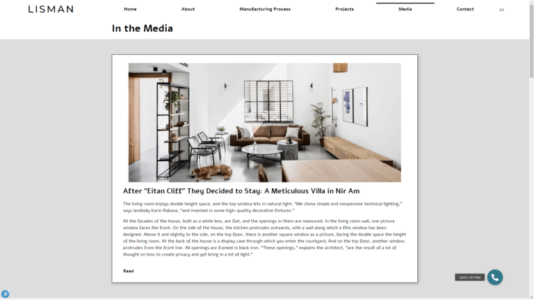
Right to Left in English
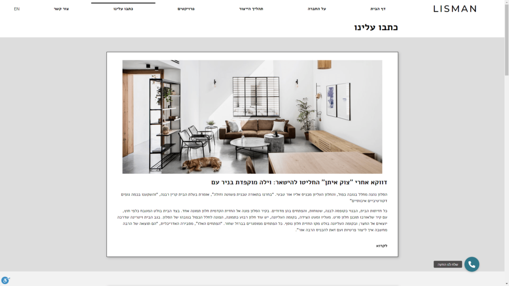
Left to Right in Hebrew
Tools Used
Website is built and maintained on WordPress with additional CSS added. Brainstorming mockups were created on Figma. Notes and feedback are created and shared on Google Docs.