*This is a project that I completed as part of my course work for the Google UX Design Certificate. The work below is strictly for educational purposes and is not related to the original Winston Pie shop. I am just a huge fan of their pies and am using their site as an example <3
My Role
UX designer leading the website design.
Responsibilities
Conducting interviews, paper and digital wireframing, low and high-fidelity prototyping, conducting usability studies, accounting for accessibility, iterating on designs, and responsive design.
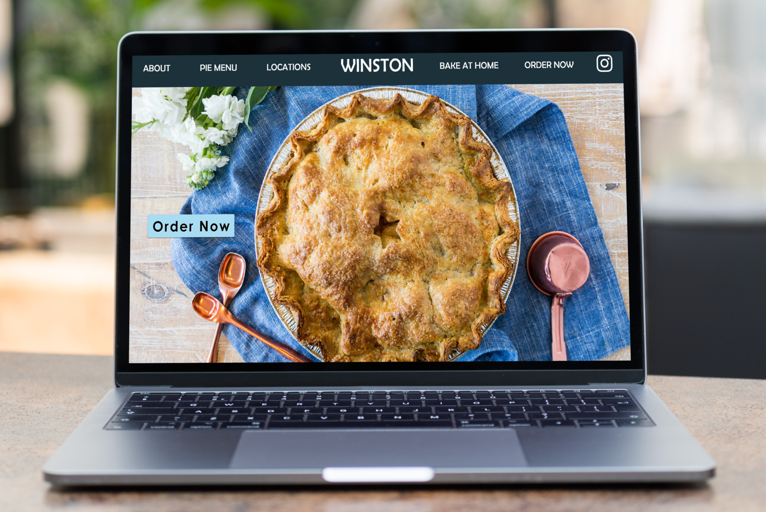
The Product
A website for a pie shop where customers can view information about the store and place online orders.
The Problem
Small restaurants now have multiple ordering systems, such as pickup, delivery, shipping, catering, and preorders for the holidays. With each type of order requiring a different shopping system, websites can be difficult to navigate.
Goal
Create a simple and cohesive flow that directs users to the ordering method that best fits their needs.
DESIGN THINKING
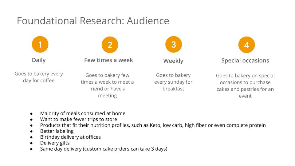
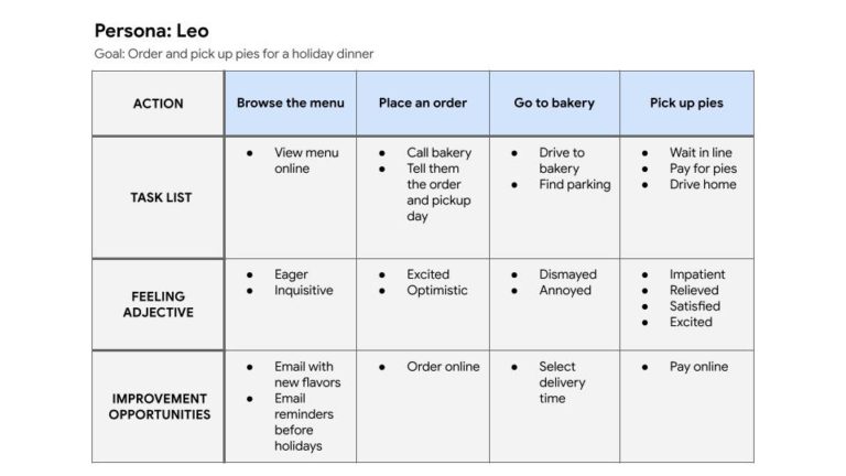
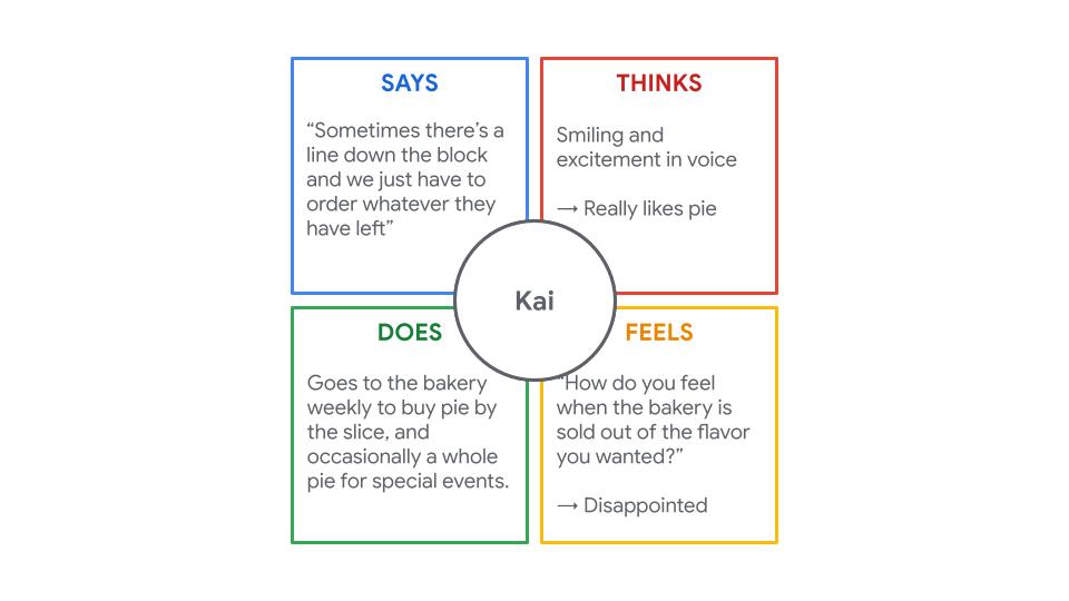
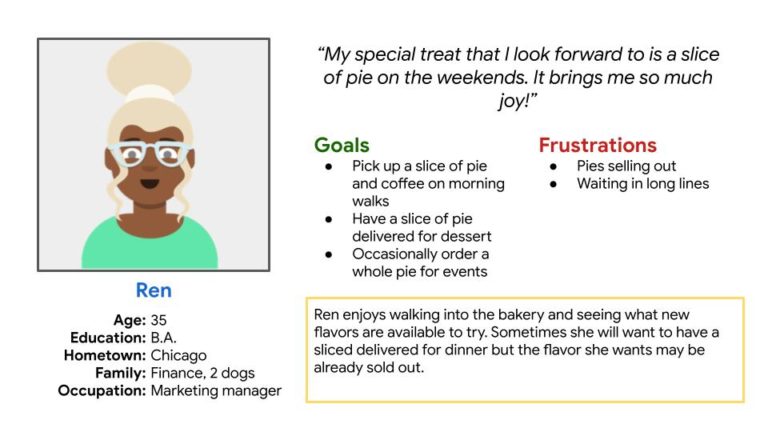
User Research: Summary
I conducted interviews, which I then turned into empathy maps to better understand the target user and their needs. I discovered that many users look forward to enjoying a sweet treat from the bakery and find it a rewarding experience. However, many bakery websites are lacking information and are confusing to navigate, which frustrate many target users. This causes a normally rewarding experience to become a challenge for them, defeating the purpose of relaxation. It is especially stressful for users during the holidays when shops are overwhelmed with orders.
IDEATION
Competitive Audit
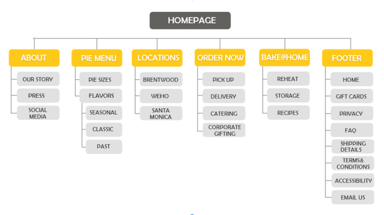
Sitemaps
STARTING THE DESIGN
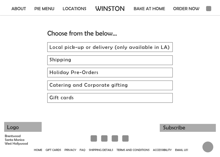
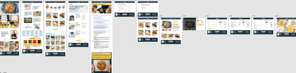
Digital Wireframes
A sequential organizational system is used for the shopping flow. As each category uses a different ordering application, this “quiz-like” layout helps guide users through each step for what best fits their needs.
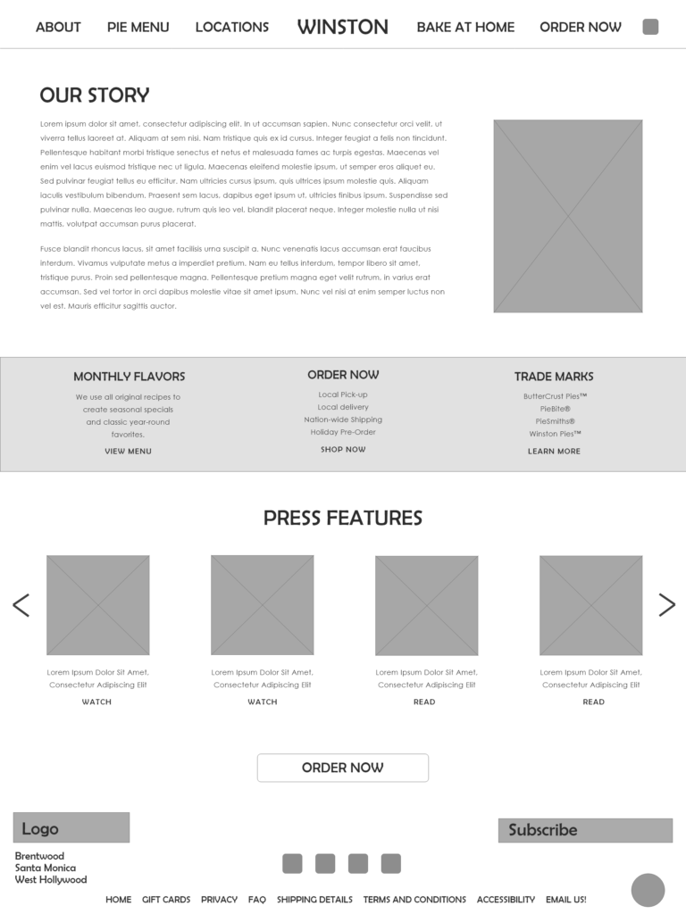
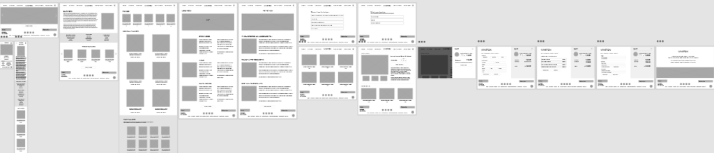
The key features of the website – view menu, shop now, original recipes – have been added to the “about” page to capture the user’s attention and encourage them to achieve the company’s goal of purchasing a product. The banner of key features also serves as a visual divider to break up the text heavy “our story” from the following “press features”. There are a dozen articles in the press features; to cut down on repetitive objects, the articles have been placed in a scrolling carousel.
Rather than one large text box for the “about” section, the text has been broken up into smaller, more digestible, pieces. Pictures are peppered through the text to keep the user interested. For those who are unable to read the full text, key words have been bolded, making it easier to skim.
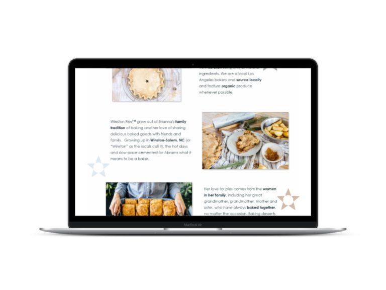
Throughout the website a “post-it-note” design is used to display text. This style has been designed with the developer in mind, using a simple combination of inner and outer shadows. The “post-it-note” style is used to convey a tone of playfulness and raises emotions of nostalgia from handwritten recipes and notes passed down.
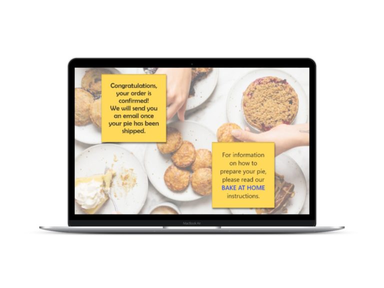
Screen size variations
The website is responsive and has been designed to fit both computer screens and mobile screens.
The design is intuitive to navigate through, more engaging with the images, and demonstrates a clear visual hierarchy. The bakery’s website increases the user’s confidence while ordering, relieves them of stress due to lower wait times, and strengthens their relationship with the restaurant.
Tools Used
The entire presentation was created on Google Docs, which includes slides, sketches and spreadsheets. Sitemaps, Wireframes, Mockups and Prototypes were create on Adobe XD.
Next Steps
Conduct follow up usability testing on the website.
Identify any additional areas of need and ideate on new features.